

OpenAI最新标志设计在员工中引发“骚乱”
Kali Hays
2024-09-24
许多员工对这个设计感到震惊。
 文本设置
文本设置
 Plus(0条)

黑色圆环寓意广泛——简洁、新阶段或虚空。然而,无论其象征意义如何,OpenAI的员工们都不希望公司使用这一标志。
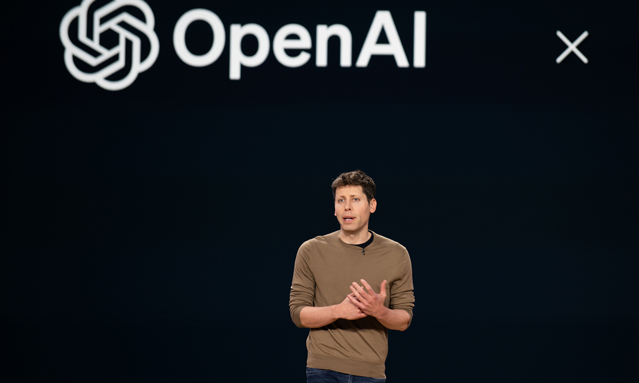
据两位知情人士向《财富》透露,OpenAI员工在最近的一次公司会议上抢先看到了公司最新的字体和标志设计,这家研发ChatGPT并引领生成式AI热潮的公司正进行品牌重塑。据消息人士透露,新标志是一个简单的黑色大“O”,容易被解读为圆环或零。许多员工对这个设计感到震惊,有人认为它看上去不吉利,也缺乏创意。一些人在会上公开表示不喜欢这个设计。
拟定的新标志与公司目前的六角形花朵标志相比,从审美的角度形成了鲜明对比。六角形花朵标志最初由设计师Ben Barry设计,寓意“精准、潜能与乐观”。鉴于员工们对新标志反响强烈以及内心对现有标志有一定依恋——这个六角形花朵标志不仅出现在OpenAI的网站上,还出现在员工喜爱的T恤和贴纸等公司周边物品上,因此,知情人士推测新标志的设计可能还会再次修改。
由内部团队负责的设计工作仍在进行中。一位知情人士表示,新的标志最早可能在明年亮相。《财富》此前曾报道,OpenAI明年还将大幅调整公司组织结构。随着对营收和投资者需求的日益关注,这家位列全球最具价值、最知名的生成式AI公司榜单的企业,可能会在2025年迎来一场彻底的品牌重塑。
知情人士透露,新标志的设计约于一年前开始,当时OpenAI加强了内部创意和设计团队建设,聘请了多位来自创意机构和平面设计等领域的新员工。推进这项工作的部分原因在于,OpenAI目前使用的品牌名称和网站文字的字体并非自有,而是由外部字体设计师创作并持有版权的授权字体。
另一方面,OpenAI的现有标志是公司内部设计的。在2022年9月(就在ChatGPT发布及该公司随之名声大噪几周前)发布的一本品牌宣传手册中,OpenAI称其标志是“公司最知名的品牌元素”,并表明其“致力于创建造福人类的技术”。
许多全球知名的科技公司在变得家喻户晓之后,都经历了品牌重塑。谷歌和Facebook分别创建了新的母公司Alphabet和Meta,作为其最知名的平台,分别有了新的标志。苹果公司也在多年间多次调整其标志性的苹果标志。
笔者曾通过电子邮件向OpenAI询问对此事的看法,但OpenAI发言人尚未作出回复。(财富中文网)
翻译:刘进龙
审校:汪皓
黑色圆环寓意广泛——简洁、新阶段或虚空。然而,无论其象征意义如何,OpenAI的员工们都不希望公司使用这一标志。
据两位知情人士向《财富》透露,OpenAI员工在最近的一次公司会议上抢先看到了公司最新的字体和标志设计,这家研发ChatGPT并引领生成式AI热潮的公司正进行品牌重塑。据消息人士透露,新标志是一个简单的黑色大“O”,容易被解读为圆环或零。许多员工对这个设计感到震惊,有人认为它看上去不吉利,也缺乏创意。一些人在会上公开表示不喜欢这个设计。
拟定的新标志与公司目前的六角形花朵标志相比,从审美的角度形成了鲜明对比。六角形花朵标志最初由设计师Ben Barry设计,寓意“精准、潜能与乐观”。鉴于员工们对新标志反响强烈以及内心对现有标志有一定依恋——这个六角形花朵标志不仅出现在OpenAI的网站上,还出现在员工喜爱的T恤和贴纸等公司周边物品上,因此,知情人士推测新标志的设计可能还会再次修改。
由内部团队负责的设计工作仍在进行中。一位知情人士表示,新的标志最早可能在明年亮相。《财富》此前曾报道,OpenAI明年还将大幅调整公司组织结构。随着对营收和投资者需求的日益关注,这家位列全球最具价值、最知名的生成式AI公司榜单的企业,可能会在2025年迎来一场彻底的品牌重塑。
知情人士透露,新标志的设计约于一年前开始,当时OpenAI加强了内部创意和设计团队建设,聘请了多位来自创意机构和平面设计等领域的新员工。推进这项工作的部分原因在于,OpenAI目前使用的品牌名称和网站文字的字体并非自有,而是由外部字体设计师创作并持有版权的授权字体。
另一方面,OpenAI的现有标志是公司内部设计的。在2022年9月(就在ChatGPT发布及该公司随之名声大噪几周前)发布的一本品牌宣传手册中,OpenAI称其标志是“公司最知名的品牌元素”,并表明其“致力于创建造福人类的技术”。
许多全球知名的科技公司在变得家喻户晓之后,都经历了品牌重塑。谷歌和Facebook分别创建了新的母公司Alphabet和Meta,作为其最知名的平台,分别有了新的标志。苹果公司也在多年间多次调整其标志性的苹果标志。
笔者曾通过电子邮件向OpenAI询问对此事的看法,但OpenAI发言人尚未作出回复。(财富中文网)
翻译:刘进龙
审校:汪皓
A black ring can represent many things – simplicity, a new phase, a void. Whatever its meaning, OpenAI employees would prefer it didn’t represent the company they work for.
In a recent company-wide meeting, staffers of OpenAI got a sneak peak at recent efforts to redesign the typefaces and logo for the company behind ChatGPT and the ongoing tech industry craze for all things generative AI, two people familiar with the company told Fortune. The new logo presented was a simple, large black “O,” easily interpreted as a ring or a zero, as one of the sources described it. Many members of staff were taken aback by the design, which struck some as ominous and lacking in creativity. A few openly voiced their dislike for it during the meeting.
The proposed new logo is an aesthetic shift from the company’s current hexagonal flower symbol, originally conceived by designer Ben Barry as one evoking “precision, potential and optimism.” Given the staff’s strong response and some internal attachment to the current logo, which adorns OpenAI’s website and corporate swag such as the t-shirts and stickers beloved by employees, one of the people familiar with matter speculated that the design of the new logo could change again.
The design work is ongoing and being carried out by an internal team, but results of their efforts could be unveiled as soon as next year, one of the people said. Next year is also set to see OpenAI dramatically alter its corporate structure, as Fortune previously reported. Add in a growing focus on revenue and investors, the stage is being set for one of the world’s most valuable and well-known generative AI companies to get a makeover in 2025.
The redesign work began about a year ago, one of the people familiar said, around the time OpenAI built out its internal creative and design team with several new hires from creative agencies and fields like graphic design. Part of the impetus for the work is that OpenAI does not own the typefaces it uses for its brand name and website text – they are licensed typefaces created and owned by outside type designers.
OpenAI’s logo, on the other hand, was created internally. In a detailed brand book from September 2022, just a few weeks before the release of ChatGPT and the company’s subsequent explosion in popularity and fame, OpenAI called its logo “our most recognizable brand element” and something that showed its “focused pursuit to create technology that benefits humanity.”
Some of the world’s most famous tech companies have gone through a major redesign after hitting household name status. Google and Facebook both created new parent companies, Alphabet and Meta, to sit atop their most famous platforms, creating new logos for both. While Apple has tweaked its iconic apple logo several times over the years.
Spokespeople for OpenAI did not respond to emails seeking comment.
请打开财富Plus APP